

ProperForm App Branding

ProperForm is a Missoula, Montana–based, pre-seed, healthtech app startup reimagining how physical therapists, personal trainers, and primary care providers deliver home exercise programs. Built for humans first, practitioners and patients alike, ProperForm’s platform enables providers to capture authentic exercise videos during sessions and transform them into personalized, intuitive guidance for at-home use. In a space long dominated by static PDFs, stock imagery, and vague instructions, ProperForm introduces clarity, confidence, and continuity of care.
Overview
The brand exists at the intersection of clinical care and human potential. Its ideal users span physical therapists, fitness coaches, and clinicians who are pressed for time, and patients navigating recovery, two audiences historically underserved by generic fitness and overly clinical healthcare branding alike. ProperForm’s app goes beyond as it honors the lived experience of recovery, the emotional weight of therapeutic progress, and the dignity of every person recovering and regaining confidence in themselves and their bodies. This dual focus set the stage for a brand identity that reflects both precision and human-centered care.
ProperForm’s co-founders, Trevor and Nate, approached me with a clear challenge: still in stealth, their existing visual identity, or rather lack thereof, wasn’t articulating what ProperForm is, where it's headed, or how the app deserves to be perceived once launched.
After previously working with other designers, none of whom was a brand designer, the team was left with a logo that they said "resembled a thumbprint", a dark and moody color palette, and an incomplete brand system that lacked the ability to scale. As a pre-launch company aiming for Spring 2026, ProperForm needed a system that could unify mission and meaning, product and emotion, providers and their patients.
The brand needed a foundation that could communicate credibility to clinicians and hope to patients. The identity had to project trust without feeling sterile, strength without becoming exclusionary, and warmth without appearing generic. What ProperForm needed, in essence, was a visual language that could tell its story with confidence and clarity. That is where I come in.
Years Active
2026 - Present
Industry
HealthTech: AI-Powered Physical Recovery App
Services
Visual Brand Identity

Balancing Grit With Compassion
Our work together unfolded through a structured, six-week discovery and design process rooted in collaboration, research, and strategic iteration. The first phase centered on discovery: a comprehensive brand questionnaire, deep market and competitor analysis, and interactive workshops grounded the project in insight. I examined not only physical therapy and fitness brands but also adjacent disciplines such as telehealth, athletic brands, health apps, and other digital wellness platforms, ensuring ProperForm’s identity could live confidently at a broader cultural nexus.
From discovery, I developed initial visual directions through curated mood boards that surfaced tone, texture, and emotional intent. Together with Trevor and Nate, we evaluated these directions, and I refined toward a unified creative approach that balanced strength, compassion, grit, resilience, hope, energy, and human warmth.
The later stages involved translating that direction into a complete visual system, logo, color palette, typography, custom pictogram-inspired iconography and patterns, as well as custom imagery guidance, with rigorous attention to flexibility, clarity, and future scalability.
Throughout the process, iteration was grounded in purpose, not preference. Every decision was tested against questions of audience resonance, product integration, and narrative alignment. The outcome was not just a visual identity, but a system that feels alive and adaptable, ready for brand, product, and motion.


A Human & Progression Centered Logo
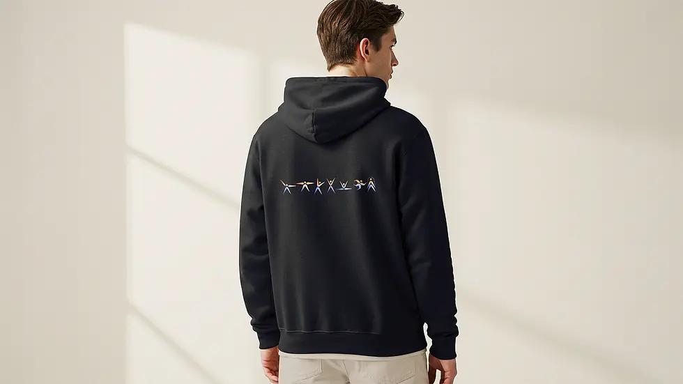
At the heart of the ProperForm identity is a logo that embodies motion, balance, and renewal. The icon combines six simplified human forms arranged in a circular configuration, each radiating outward in a raised hands gesture, signifying the shared celebration of individual and collective recovery progression. This assembly evokes not only physical movement but also the idea that recovery is a journey shared between provider and patient.
Every element of the mark was intentional. The human pictograms depicted in both the logo mark, as standalone icons, and as brand patterns draw from the brand's visual language to ensure clarity and accessibility across product and platforms.
The asymmetrical forms subtly mirror dauphine clock hands, an elegant metaphor for physical recovery and progression over time. The progression from thin to thick within the icon reflects a continuum of strength and healing, reinforcing that recovery is not instantaneous but a steady evolution. Finally, the negative space at the center evokes an abstract Macedonian star, signifying radiance, optimism, and momentum.


Identity & Ethos
The result of this collaboration is a comprehensive visual identity system and brand style guide that embodies ProperForm’s ethos: every move, made better. The identity merges precision with empathy and progress with purpose, equipping the brand to present confidently across touchpoints, from product UI to brand collateral.
A custom human pictogram system forms a central asset. Seven core movement poses span therapeutic and fitness actions, each articulated across twelve graduated weights, symbolizing stages of recovery progression from early recovery to restored strength. These pictograms function as standalone icons or structured patterns, enabling ProperForm to express progression visually across platforms and contexts.
Complementing this system is a thoughtfully calibrated visual language: a modern, refined type system selected for clarity and trust; a color palette informed by psychological resonance, balancing trust and stability with warmth and optimism; and photography direction that embraces dynamic, human-centered imagery to reflect shared teamwork and individual resilience. Together, these components form a cohesive, future-ready identity that adapts beautifully into product and storytelling.


Propelling Users Forward
While ProperForm is still emerging from stealth and preparing for its Spring 2026 launch, the impact of the identity work is already clear. The new system positions the brand with intentional distinction, avoiding the extremes of hyper-masculine fitness aesthetics and overly clinical healthcare design. Instead, ProperForm occupies a thoughtful, balanced space that honors the emotional and physical journey of recovery.
Internally, the identity generated alignment and confidence. During the final weeks of brand development, co-founder Trevor shared that seeing the new logo and palette in their workspace sparked genuine excitement and affirmation. That kind of resonance is a signal that the visual language does more than look good; it moves better.
As ProperForm continues toward launch, it does so with clarity, confidence, and a brand system finally in proper form, ready to propel its audiences and users forward. Trevor shared, "It was great collaborating with Elissa on ProperForm’s brand development. The work she's done has set a strong foundation for how the brand will continue to evolve. I truly appreciate her attention to detail, organization, and professionalism throughout the process."
In the weeks leading up to app launch, the ProperForm team ultimately chose to go in a different direction. Regardless, I wish them nothing but Boundless success.
